
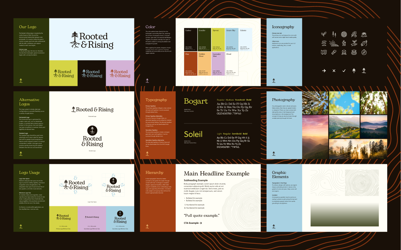
Brand identity design for New Home Star's 2026 Sales Rally event.
Scope: Logo Concept | Visual Language | Brand Strategy | Brand Guidelines | Print Collateral

New Home Star's 2026 national sales rally, Rooted & Rising, returned to Park City, Utah. Sales leaders, agents, and select clients from all over the nation come together for three days of training, recognition, and camaraderie. Rooted & Rising, this year's theme, is centered around the fact that New Home Star has built the right foundation, created stronger roots, and aligned the business. Now it’s time to grow—giving top performers clarity, energy, and ownership to lead the next phase across their teams.
The brand identity draws inspiration from root systems, upward momentum, and long-term growth, creating a visual world that reminds attendees that New Home Star is continuing to grow but will not forget or leave behind their strong foundation. One key symbol that sparked the theme of this year's event was that of a conifer tree: Built to thrive in challenging mountain conditions, conifers develop strong roots that create the stability needed for long-term growth. It is a fitting representation of New Home Star: grounded, resilient, and ready to rise.
To interpret the direction, I developed two concepts. The first focused on bright, earthy colors and textures to feel energizing and uplifting while keeping a rooted, heritage feel. The second leaned into a premium mountain mood: rooted in history, grounded by the mountains, with deeper colors that feel luxurious, rewarding, and inspiring.
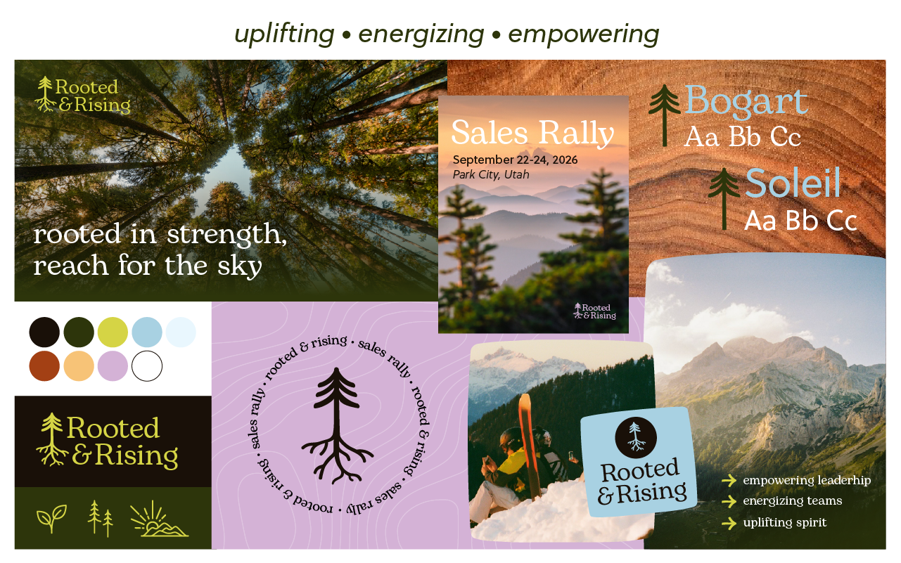
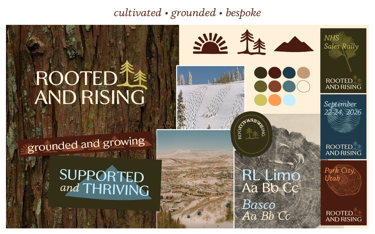
Of the eight concepts developed, my first concept was selected with minimal feedback. The Rooted & Rising mood board was enthusiastically received, and the resulting identity gave the 2026 New Home Star Sales Rally a look distinct from the previous Park City rally that honors the foundation the team has built while pointing toward what comes next.
Key Outcomes

© Jessica Cuevas 2026. All Rights Reserved.